OECD Economies: GDP Status Check
Where are the OECD economies at in the recovery? In this article we take a unique approach to analyzing the patterns of GDP growth across the OECD economies over the past 12 years. Why? Well for starters it's nearing GDP season (Q1 results will be out soon for a few countries; the UK has already announced its Q1 2010 results). Second, it's useful to occasionally challenge your perceptions about which countries are growing and which aren't. Third, it's a timely status check in terms of the overall recovery across the OECD economies.
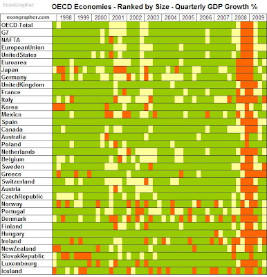
The first table shows quarterly GDP growth for the OECD economies that report total GDP (Gross Domestic Product) on a quarterly basis. The economies are ranked by size, and the rules for the heat map are: Green = >0.2% Yellow = >-0.2%<0.2% Orange = <-0.2%. In other words the yellows are where economic growth was pretty much flat, while green indicates growth and orange indicates contraction. The pattern in recent years is unsurprising, but it shows a few standouts that got off lightly during the recession e.g. Poland, Australia, and to a lesser extent Korea. It's also informative to assess the patterns across time.
The second table shows GDP growth on a year over year basis, again with economies ranked by size (this time the rules are similar but with -1%/1% instead of 0.2%) . It's interesting to note that Australia, Poland, and Korea are countries which have left recession on an annual basis, with others like New Zealand, and Luxembourg showing promising signs. Again, eyeballing the history you can see which economies have tended to consistently grow and those that have had more patchy history. You can also see the early 2000 recession, and how it compares to the global financial crisis.
Summary
It is useful and interesting to look at the data from different angles from time to time, because it helps you check your assumptions and beliefs, and it allows you to generate new insights. Some of the questions you can answer by glancing at the tables are: Which economies are growing? Which economies have experienced the most consistent growth? Which economies showed the most strength throughout the crisis? And therefore, which economies might produce the most compelling investment opportunities? The final question can't be fully answered here, but by reviewing the data in a new way, it can begin to be answered.
Sources:
Econ Grapher Analytics www.econgrapher.com
OECD www.oecd.org
Article source: http://www.econgrapher.com/24apr-oecdgdp.html
© 2024 Benzinga.com. Benzinga does not provide investment advice. All rights reserved.
Posted-In: economic growth OECDGlobal Economics


