


The VIX ended last week just above 16, bringing it to its highest level in 2024. What does this tell us about investor sentiment, and how does this compare to previous market cycles?
Let’s take a quick tour of market history through the lens of the VIX, focusing on which levels have tended to be good signals of market reversals, then relate that back to our current setup with a VIX around 16 as we move further into the 2nd quarter of 2024.

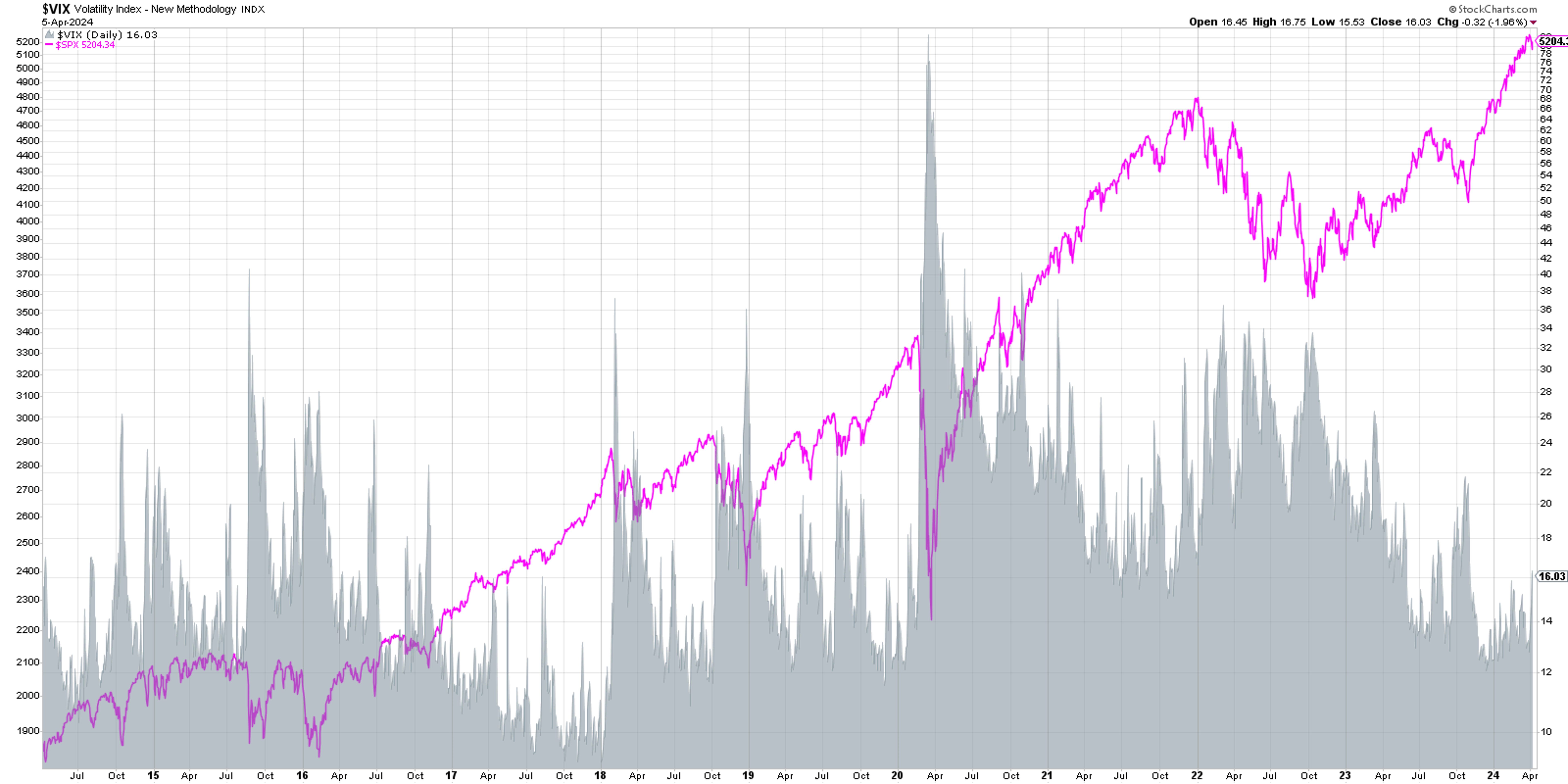
We’re starting with a ten year chart of the S&P 500 index (shown in pink) and comparing that to the VIX (shaded in gray). You’ll probably be drawn to the spikes in the VIX in 2020, 2019, and 2015, each of which represented significant drawdowns for the S&P 500.
Why does the VIX tend to push higher when the SPX drops lower? This goes back to one of my favorite market maxims, “The market goes up the escalator and down the elevator.” Basically, bull markets are marked by slow-and-steady accumulation on the way up, as investors are adding positions over time.
But when investors get nervous, fearing a drop in stock prices, they tend to panic and sell very quickly. Indeed, there is often a feedback loop where selling drives prices lower, which then begets further selling, which drives down prices even further.
The VIX is often called the “fear gauge” because of this inverse relationship to stock prices, but I prefer the term “uncertainty gauge” as a better reflection of what the series is actually designed to measure.
Let’s look at the inverse relationship in more detail.
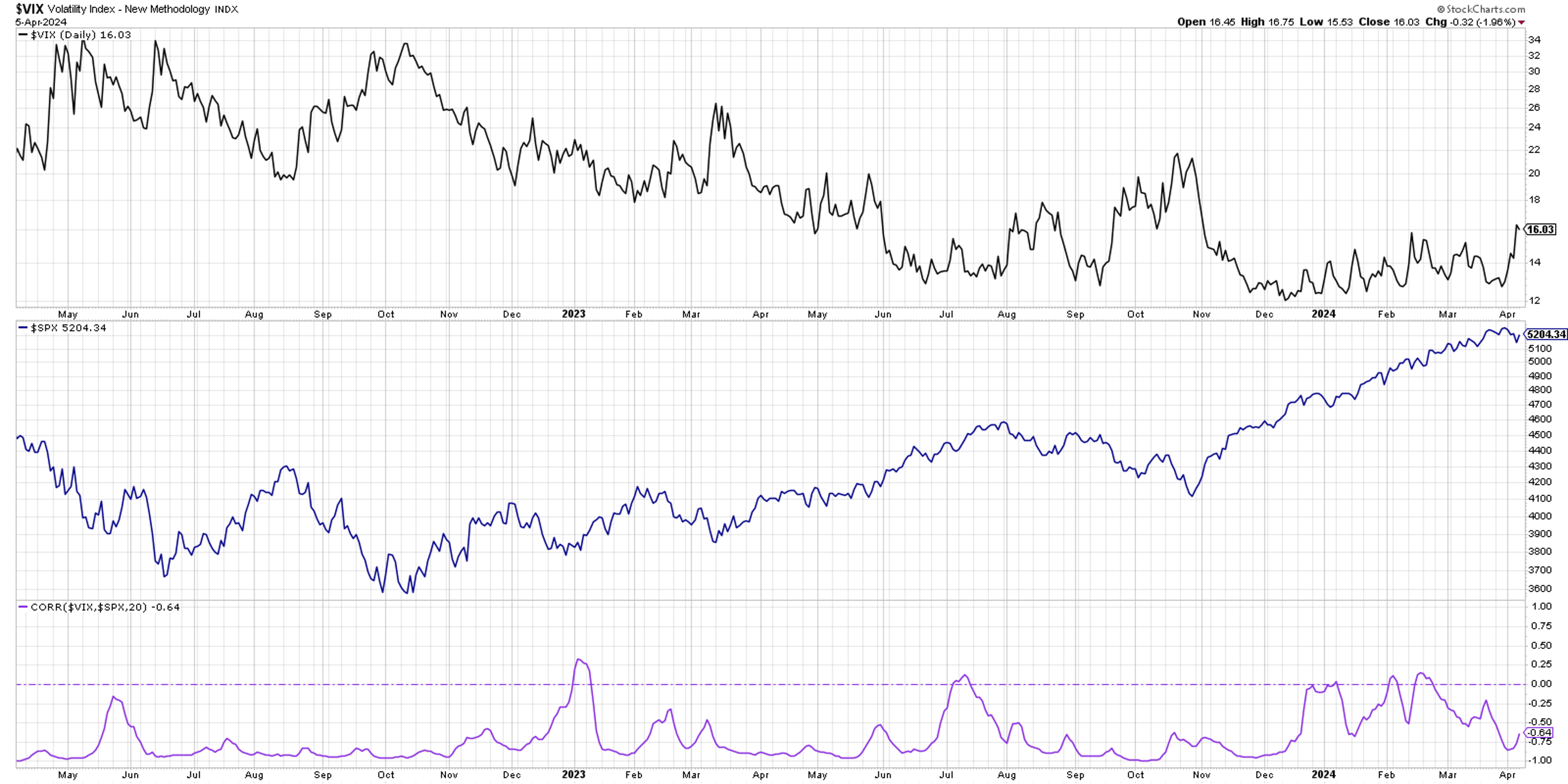
Here we’re showing the VIX in the top panel, the S&P 500 in the middle, and then the 20-day rolling correlation between the two data series. Notice how there is often a strong inverse relationship between the two? While there have occasionally been spikes in the correlation to around the zero level (basically, no relationship between the two data series), the correlation has usually remained in the -0.7 to -1.0 range.
When I’m considering two series with an inverse relationship, it can be helpful to invert one of the data series.
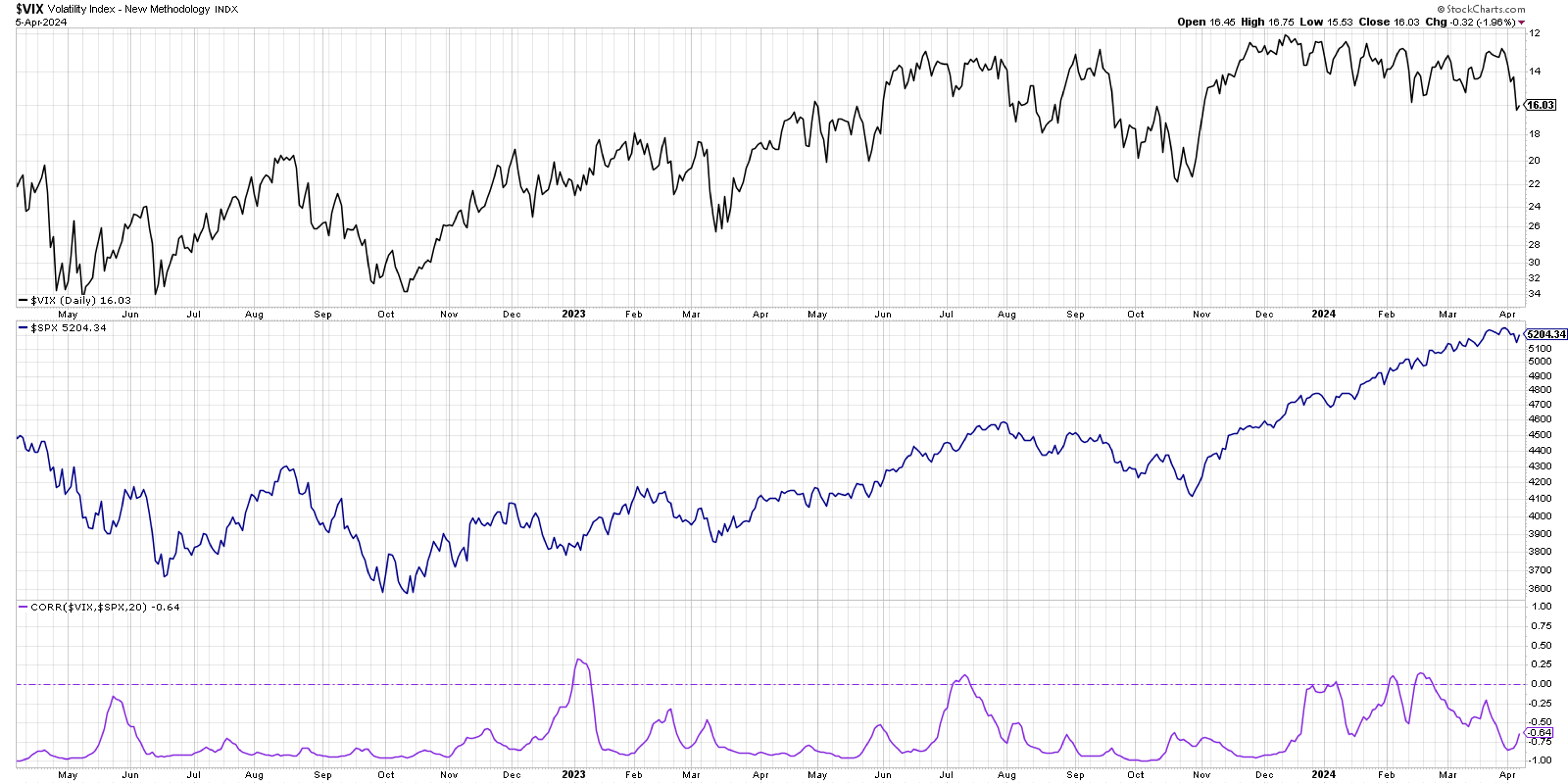
Now we’re showing the VIX upside down in the top panel, which makes it easier to recognize how drops in the S&P 500 usually coincide with spikes in the VIX. So have we seen enough of a rise in the VIX to raise a red flag on this bull market? Not quite, in my opinion. But I do have some key levels I’ll be watching through Q2.
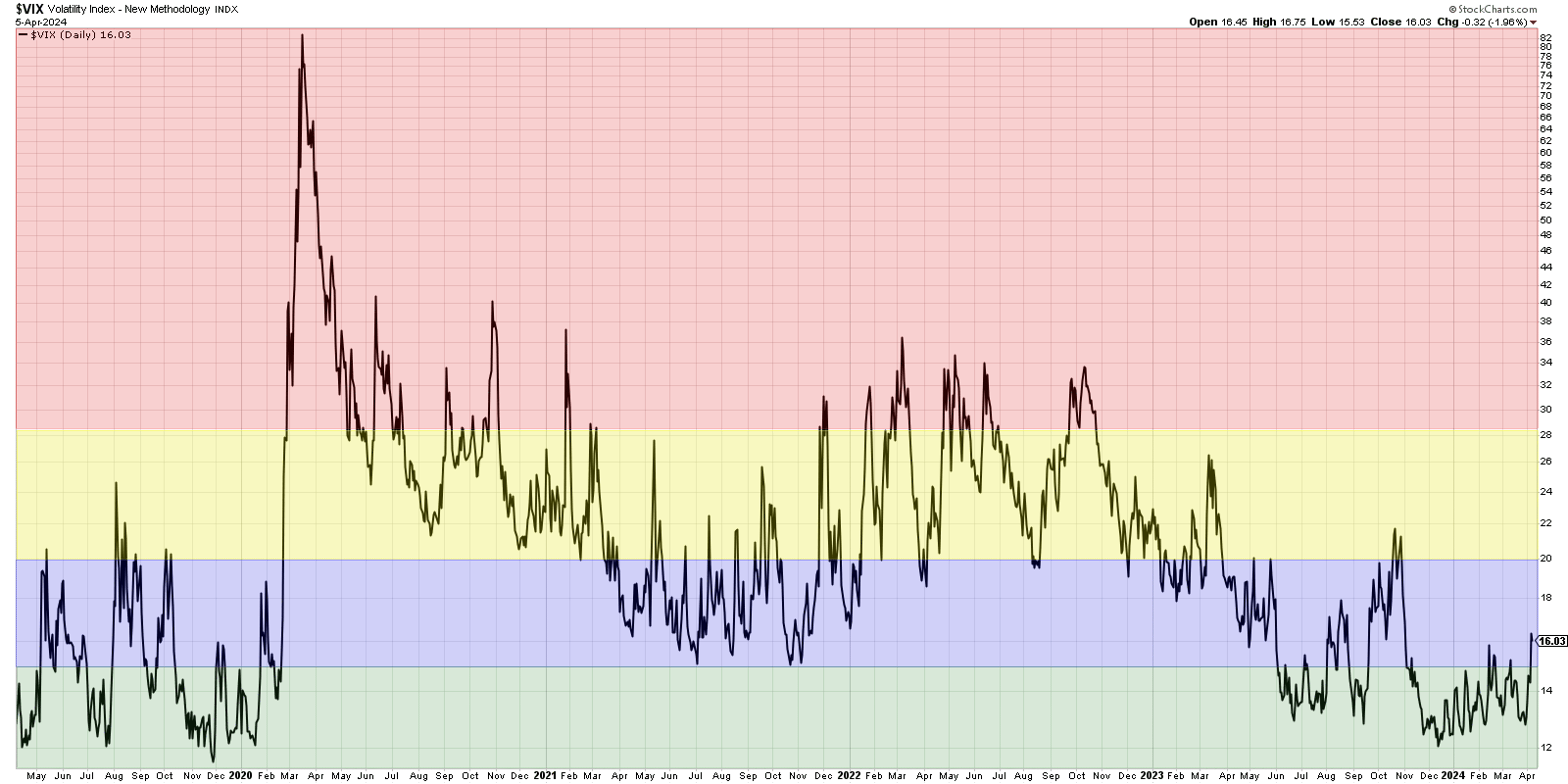
In a low-volatility environment, as we’ve seen in the last eight months, similar to 2019 and 2017, the VIX spends a great deal of time below the 15 level (green shaded area). So, a VIX below 15 represents a low-volatility bull market phase.
When the VIX pushes above 15 but remains below 20 (blue shaded area), this suggests that the long-term trend is still positive, but we are likely entering a pullback phase within that bullish trend.
When we see a VIX push above 20 but not above 28.5 (yellow shaded area), that would mean we are now in a high-volatility environment. The S&P 500 is probably in a clear pullback by now, and investors will be questioning whether it’s the beginning of a much deeper bearish phase.
The last time we broke above 20 was heading into the October 2023 market low. I was fairly bearish at the time, because the VIX pushing above 20 usually means we’re just getting started with a market decline. The strength of price action off the October low, along with bullish rotations in breadth and momentum indicators, told us that the VIX above 20 was a false alarm.
Now if the VIX pushes above the 28.5 level (red shaded area), then the S&P 500 has essentially entered a confirmed bearish phase. This is a level I learned about from Tim Hayes at Ned Davis Research, based on research they had conducted on a deep history of the VIX.
The last two times we saw a rotation above that key 28.5 level? November 2021 just before the 2022 market top, and February 2020 at the beginning of the COVID era. A VIX above 28.5 is actually fairly uncommon, and I’ve learned to treat extremes in the VIX as a major red flag and a good reason to rotate to risk-off positions.
A quick review of market history tells us that a VIX around 16 indicates a likely pullback scenario within a bullish phase. However, it also tells me to be prepared for a higher VIX, which would mean higher levels of uncertainty. As we’ve seen with these charts, higher uncertainty usually means a higher risk that the market takes the elevator down to much lower levels!
RR#6, Dave
PS- Ready to upgrade your investment process? Check out my free behavioral investing course!
David Keller, CMT Chief Market Strategist StockCharts.com
Disclaimer: This blog is for educational purposes only and should not be construed as financial advice. The ideas and strategies should never be used without first assessing your own personal and financial situation, or without consulting a financial professional.
The author does not have a position in mentioned securities at the time of publication. Any opinions expressed herein are solely those of the author and do not in any way represent the views or opinions of any other person or entity
This article is from an unpaid external contributor. It does not represent Benzinga's reporting and has not been edited for content or accuracy.
© 2024 Benzinga.com. Benzinga does not provide investment advice. All rights reserved.
Trade confidently with insights and alerts from analyst ratings, free reports and breaking news that affects the stocks you care about.

