Loading...
Loading...
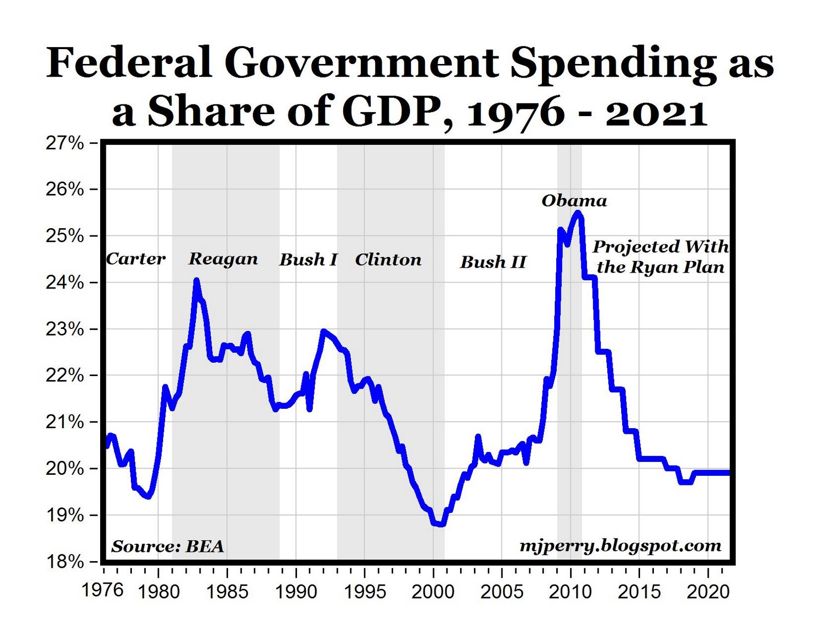
Looking at federal spending as a share of GDP during the terms of U.S. presidents, federal spending increased under Carter and both Bushes, remained about the same under Reagan, decreased under Clinton to the lowest level since 1970 and skyrocketed under Obama to the highest level since WWII. If the Ryan Plan is successful at getting federal spending below 20% of GDP by 2018, it would the first time since 2002 that the size of the federal government is below one-fifth of the U.S. economy.


© 2024 Benzinga.com. Benzinga does not provide investment advice. All rights reserved.
Benzinga simplifies the market for smarter investing
Trade confidently with insights and alerts from analyst ratings, free reports and breaking news that affects the stocks you care about.
Join Now: Free!
Already a member?Sign in

