


We have some exciting news this week. Some feature changes have been made based on your valued feedback. As SONAR users dive deeper into the data and find new ways to generate insight, we're hearing more from customers about how to improve the user experience.
Y-Axis Label Enhancements
Topping the list this week is a major change made to the way time-series chart labels are designed. With so many new data sources from multiple modes of transport, spanning multiple countries, coming online, we've added new labels to the y-axis on charts that show the value being represented. For example, in the case of a percentage for our most popular outbound tender reject index (OTRI.USA), the label "PCNT" will appear next to the values.
Simply go to the "Display" option at the top right of a chart and select "Show Units in Y-Axis" option.


SONAR Ticker: OTRI.USA with "Show Units in Y-Axis" checked under "Display" option
Other indices where we've made similar changes include freight rates where multiple countries and currencies are involved. A great example would be our air cargo indices, where you could choose to display air cargo rates in either Euro or U.S. dollars for air freighter rates on the Frankfurt to North America lane. In this example, the word "Euros" appears next to the currency value for the rates being displayed.

SONAR Ticker: AIREUR.FKGNOA with "Show Units in Y-Axis" checked under "Display" option
Other y-axis label changes include indices where the label "INDX" will appear next to the value designating an index is being displayed. An example would include our outbound tender volume index (OTVI.USA).
SONAR is continually evolving with weekly updates to product features, as well as new data sets. Many of the new features and data enhancements made to SONAR are driven directly by user feedback. If you're not currently a SONAR user and would like to learn more, we invite you to sign up for a free trial here.

SONAR Ticker: OTVI.USA Seasonality View with "Show Units in Y-Axis" checked under "Display" option
Treemaps
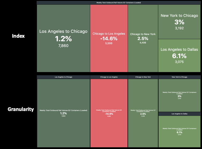
The other major feature change this week involves treemaps, where you can now choose which data view you want displayed–index or granularity. To access these new features, simply select the blue plus sign at the top right of the home page to add a widget, then select "Treemap." When the treemap selection page appears, you can go to the section titled "Section Headings" and select either "indices" or "granularities," depending on the data view you want to display.
To show you how this works, let's build a treemap displaying the total weekly volume of 53-foot loaded intermodal containers by lane for just the Top 5 lanes in North America.

Once you've built the indices you want to be displayed, simply click "Save" and you'll be able to see the following treemaps depending on whether you've selected "Indices" or "Granularities."
Home Page Alerts
The final feature change this week is an alert on the home page that tells you that you're viewing a Global Page, which is a view-only page seen by all SONAR users. While you can make changes to this page, only you will see these changes and they'll be lost once you move to another page. To create your own pages that will be saved, go to "My Pages" and add charts using the "Edit Pages" and "Add Page" tab.

Image Sourced from Pixabay
© 2024 Benzinga.com. Benzinga does not provide investment advice. All rights reserved.
Trade confidently with insights and alerts from analyst ratings, free reports and breaking news that affects the stocks you care about.

