


The major stock market indices have been moving in a volatile, back-and-forth, up-and-down fashion for three and one-half months now.
For anyone attempting to stay in tune with the trend of the market, this has been a frustrating time as the S&P has changed direction no fewer than nine times since the beginning of December.
Yet during this annoying period, the S&P 500 has made a total of 12 new all-time highs, the NASDAQ moved back above the 5,000 level (albeit only briefly), and even last year's much-maligned small caps reached fresh all-time highs.
The problem is that the moves to new highs were not met with follow-through buying or a new leg higher. As such, the current trend among the fast-money types is to greet each new high with selling.
While the bears have clearly prevented the bulls from gaining any meaningful ground, our furry friends remain frustrated as well. You see, despite all the volatility and all the big down days seen this year, the S&P 500 closed Friday just 3% below the most recent all-time high set on March 2.
In short, both teams have had opportunities. And yet both teams have failed to get anything done. Thus, the obvious question is, why?
For Every Plus There Is a Minus...
To hear the bears tell it, their problem is that every time they get something going to the downside, some central bank announces plans to print a whole boatload of new money. Therefore, the big banks, hedge funds etc. able to participate in various carry trades continue to play on. And then the dip-buyers come in with the knowledge that at least some of those new yen and euros being printed will wind up in the U.S. stock (and bond) market.
On the other side of the court, our heroes in horns continue to struggle as well. The problems the bulls face include (a) a surging dollar, (b) falling earnings expectations, (c) a Fed that threatens to become a little less friendly in the next few months, and (d) valuations that are no longer a positive.
So there you have it; every plus has been met with a minus recently and vice versa. And the end result is a manic/depressive market that can't move in any one direction for even a month at a time.
Are Valuations Really a Problem?
The bears contend that valuations are becoming a problem. By now, everyone has seen Dr. Shiller's CAPE index and the dire warning it provides. However, valuation is a VERY tricky subject as there are many different metrics to consider and just as many ways to view the data.
So, in an effort to determine if valuations are indeed the problem that our friends in the bear camp contend, we thought we would take a look at a couple P/E ratios, the Price-to-Sales, Dividend, and Book Value ratios, as well as a model that looks at stock market values relative to interest rates.
So, let's get started...
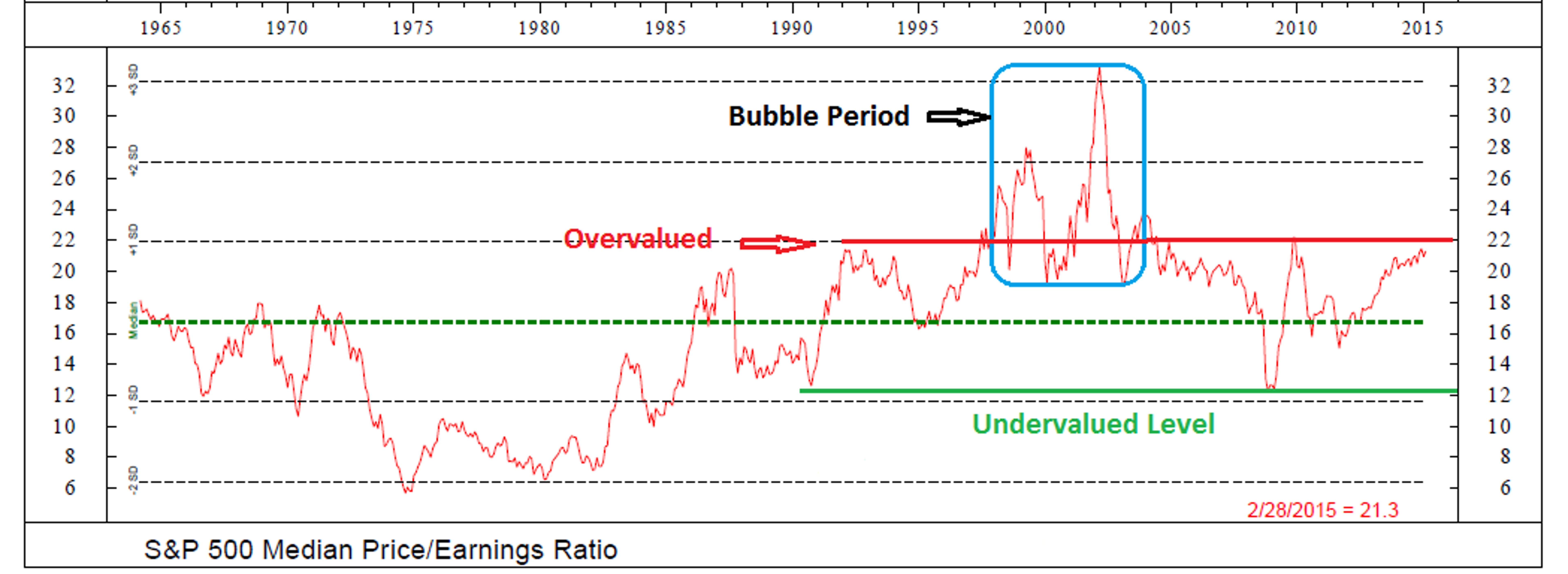
First up is the Median Price-to-Earnings Ratio. For this calculation, we use the S&P 500's median P/E on a 12-month trailing basis. Such an approach attempts to smooth things out by focusing on the median earnings within the index.
Take a look at the chart of this indicator below. The first point to understand is that what was overvalued in the 1960s, 70s, and early 80s is no longer an overvalued reading. No, since 1990, the levels have clearly shifted.
S&P 500 Median Price-to-Earnings Ratio </h3<
The second point to consider is that the period within the blue box was clearly a bubble. As such, it is probably best to assume that the readings seen between 1999 and 2003 were outliers.
So, if we remove the bubble readings, we can draw in the "overvalued line" at about the 22 level and the "undervalued" extreme down around 13. And we can argue that the green dashed line, which represents the median reading back to 1964, is now the mid-point of the range of P/E valuations seen since 1990.
Using these assumptions, the takeaway is that stocks are now very close to what has been considered overvalued over the past 25 years. Advantage Bears.
Next, let's take a look at the S&P's P/E ratio using GAAP (generally accepted accounting principles) earnings. We like this approach due to the fact that GAAP earnings remove a lot of the games that companies play in order to puff up their reports. In short, we consider GAAP earnings to be a "Just the facts Ma'am" approach.

S&P 500 Price-to-Earnings Ratio (GAAP Earnings)

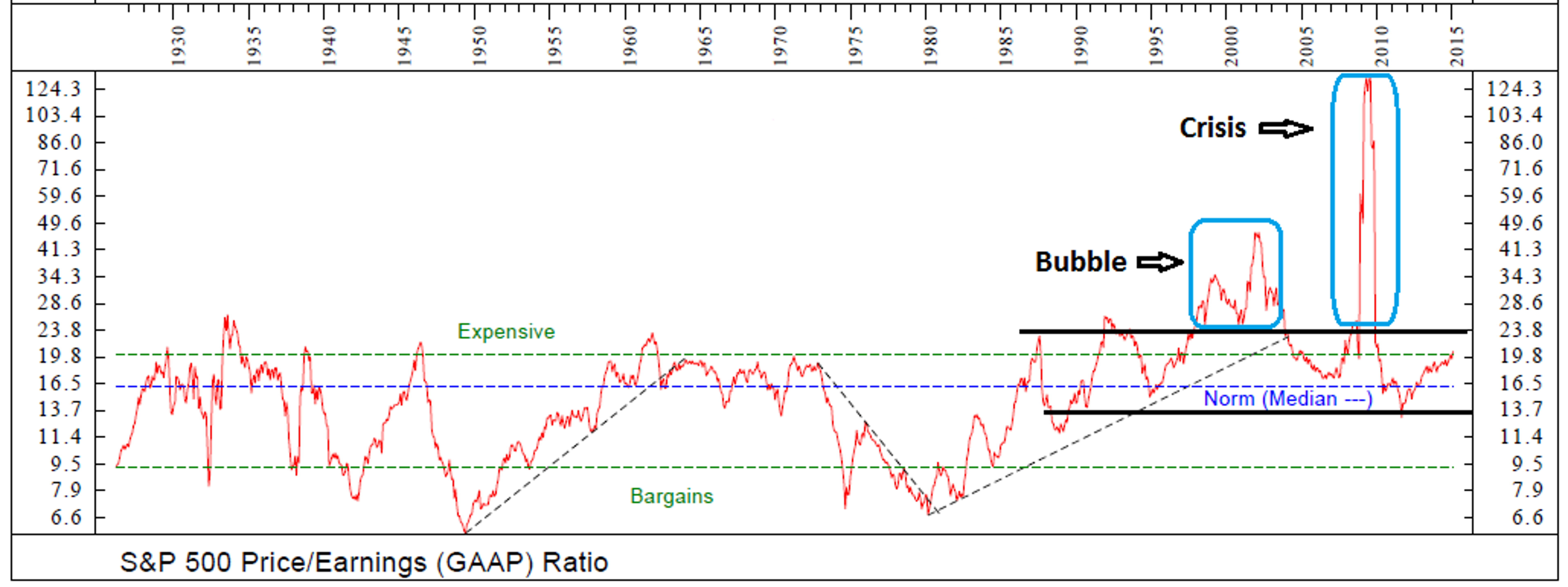
The current reading for this ratio is 20.57 as of the end of February. This is below the 25-year average of 25.18, above the 50-year average of 19.20 and also above the full period (89 years) average of 17.01. Therefore, the bulls argue that this measure of valuation is not a problem at this point.
Yet, as the chart clearly illustrates, there are two periods over that last 89 years that should likely be considered outliers - the 2000 technology bubble period and the "credit crisis" of 2008-09.
Thus, if we are going to be objective, it is probably a good idea to toss out those two periods. In doing so, it appears that readings somewhere in the vicinity of 20-23 can be considered "expensive." And with a current reading at 20.57, it is very hard to argue that stocks are anything but extended at this time. Therefore, this indicator can also be put in the bear's column.
There Are Other Metrics Besides Earnings
While P/E ratios represent much of the focus in this arena, investors need to understand that we have been living in an era of "financial engineering" for some time now. This means that earnings really aren't a pure measurement due to things like stock buybacks, etc. Therefore, it only makes sense to look at other valuation metrics including Price-to-Sales, Price-to-Dividend, and Price-to-Book Value ratios.
S&P Industrial Price-To-Sales Ratio

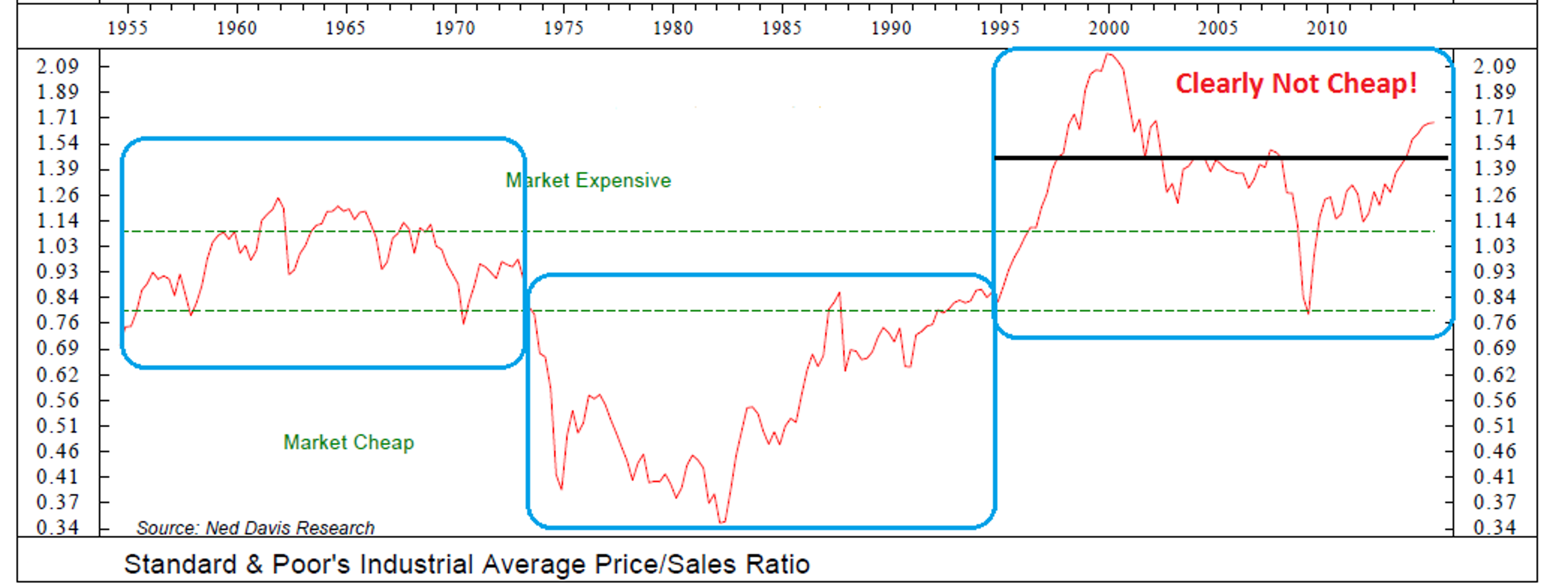
At first blush, the Price-to-Sales chart of the S&P appears to be utterly useless. Over the past 60+ years, there have been what appears to be three distinctly different eras in the market.
From 1954 through the mid-1970s, the Price-to-Sales ratio stayed in a very definable range and it was easy to determine when stocks were expensive/cheap using this measure. But then the secular bear market hit, and suddenly what had been considered "cheap" for 20 years wound up getting a lot cheaper.
Enter the next era of this indicator. For the next 20 years, the lines of demarcation for over/undervaluation were dramatically different. And then just to show how difficult the valuation game can be, things changed again - dramatically - starting in 1995.
So, if we focus our attention on the current era (the last 20 years) the picture becomes a little clearer. However, we still have the "bubble" valuations of 2000 to deal with. Whether or not you decide to toss out the 2000 levels, the bottom line is that stocks are clearly NOT cheap by this metric. So, yep, you guessed it; this indicator also favors the bears.
Next up is the Price-to-Dividend Ratio.
S&P 500 Price-To-Dividend Ratio

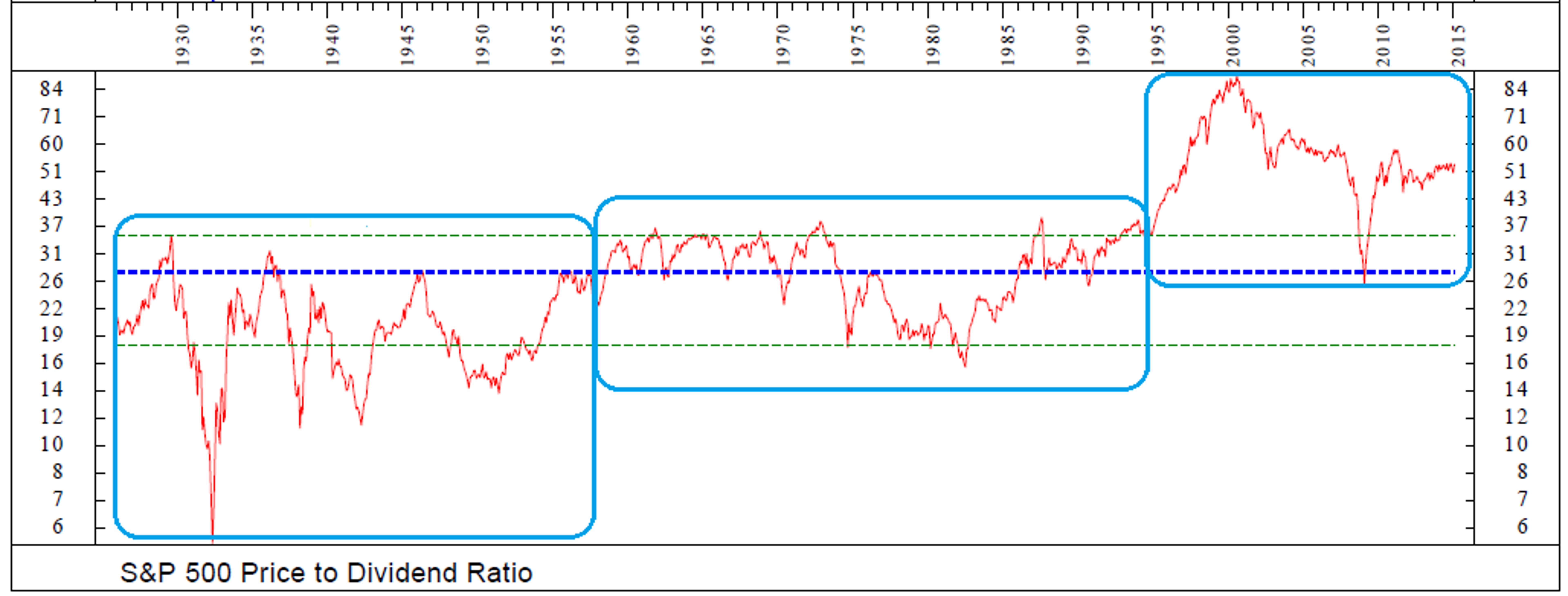
As was the case with the Price-to-Sales ratio, there are three distinctly different "eras" to be seen on the P/D chart. There was one range seen from 1925 through the mid-1950s, another from 1957 through 1995, and yet another since 1995. (BTW, is the theme that the valuation game changed in 1995 becoming apparent yet?)
The next problem with the P/D ratio is the change in corporate behavior in this "new era." The bottom line is that companies have focused more on stock buybacks than on paying dividends. And because of this, the ratio has become quite skewed.
And then once again, there is the bubble period to deal with as valuations of all shapes and sizes simply got out of whack with historical levels.
So, what is the takeaway from the P/D? First, the "financially engineering" era has skewed this ratio rather severely. As such, we don't put much emphasis on this particular measure of value. However, once again, it is hard to argue that the stock market is anything but extended by this ratio.
And speaking of metrics that have gotten out of whack, let's now turn to the Price-to-Book ratio.
S&P 500 Price-to-Book Ratio

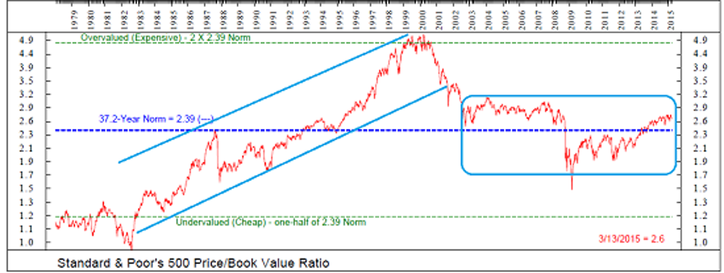
At first glance, this indicator also appears to provide little help in determining whether or not stocks are overvalued. The problem is that the P/B ratio moved steadily higher from the early 1980s through the tech bubble of 2000 and then moved straight down into 2003.
And while our view can be considered more art than science, we will argue that there actually has been a fairly definable range of the P/B ratio over the last 10-15 years. Yes, the ratio got out of whack to the downside during the crisis in 2008-09. However, since 2002, the range has been fairly steady.
Although there are not a lot of data points to work with here, it does appear that the high end of the P/B range since 2002 has been about 3.0, while the low end (excluding the crisis period) has been around 1.9. So, with the current reading at 2.6, we can argue that while the P/B may not horribly expensive, it also is a far cry from cheap.
Thus, an objective analysis suggests that like the P/E, P/S, and P/D, the P/B is also extended at this point in time. And yes, this is another check mark in the bear column.
But Remember, Things Don't Matter Until They Do...
To be sure, the bears have a case here as all of the primary valuation metrics are either already in overvalued territory or on the cusp. So, is this a reason to head for the hills? Is it time to take less risk in your stock portfolio or start hedging?
In a word, no.
You see, in the stock market, something like valuation doesn't matter on a day-to-day basis... until it does, of course! The trick then is to determine when valuations might become an overhang on the market.
The next valuation indicator actually sums up the situation nicely.
Valuation Model: Price Relative to Interest Rate Environment

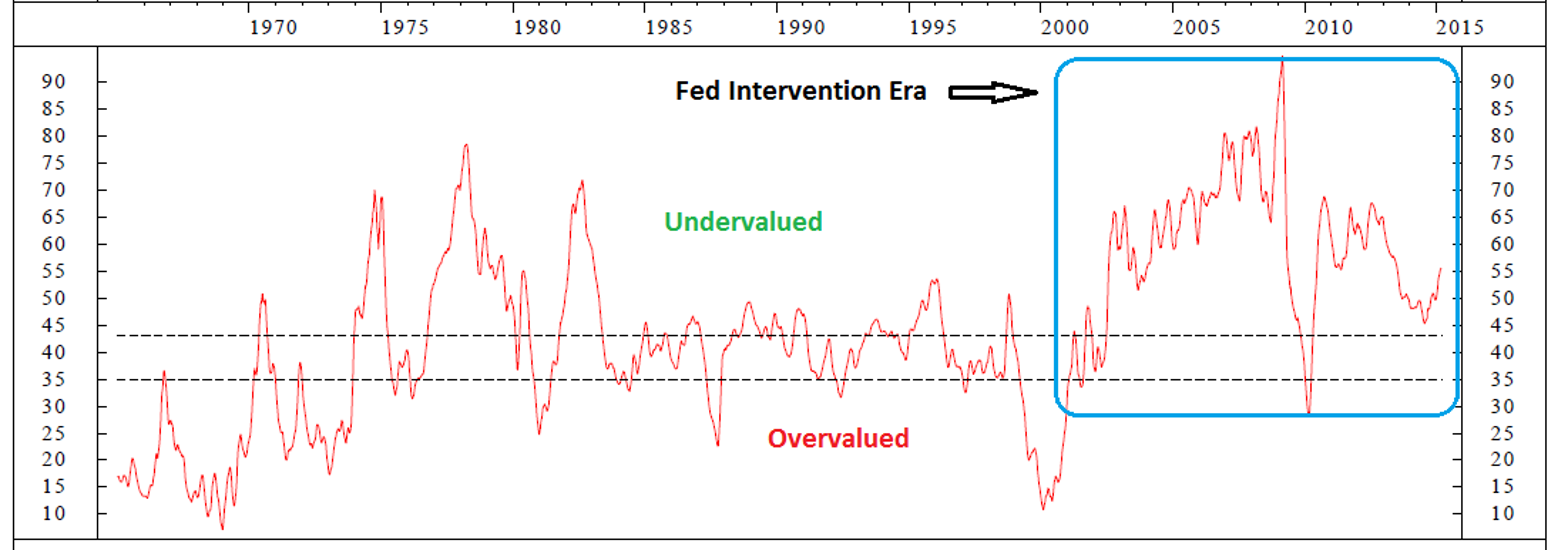
In looking at the chart above, it is important to first recognize that the under/overvaluation zones are reversed compared to the other charts. Higher readings represent undervaluation while lower readings represent overvaluation. This is due to the fact that the model compares price to a host of interest rate yields.
This model compares the weekly price of the S&P 500 to the 10-year averages of earnings yields, dividend yields, book value yields, real earnings yields, real dividend yields, and then the spreads between the yields of earnings and bonds, and dividends and bonds. In other words, the price of the S&P 500 is being compared to all kinds of yields available in the market.
As you can see, the current reading is SOLIDLY in the "undervalued" zone.
How can this be, you ask? Aren't all the other indicators pointing to the stock market being overvalued?
The explanation here is simple. When compared to the current level of interest rates and yields on competing instruments, stocks are cheap on a historical basis.
And in our humble opinion, THIS is the key to the current valuation debate. Yes, stocks are overvalued by historical standards using traditional metrics. There is no argument here. However, given that rates around the world are so low, stocks continue to represent RELATIVE bargains!
The bottom line is that unless/until the central banks of the world stop printing trillions of yen/euros each year - or until the U.S. economy really starts to kick into gear (which would likely trigger inflation) - it is this RELATIVE valuation story that is likely to dominate the action.
Put another way, until the current era of central bank intervention comes to a close, stocks are likely to represent a solid alternative for new money.
So... are stocks overvalued using traditional metrics? Yes, there is no denying the facts. However, the question is: Does it matter? And the answer is that until the central bankers stop printing money, probably not.
Loading...
Loading...
SPYSPDR S&P 500
$565.00-0.01%
Edge Rankings
Momentum
64.28
Price Trend
Short
Medium
Long
© 2025 Benzinga.com. Benzinga does not provide investment advice. All rights reserved.
Posted In:
Benzinga simplifies the market for smarter investing
Trade confidently with insights and alerts from analyst ratings, free reports and breaking news that affects the stocks you care about.
Join Now: Free!
Already a member?Sign in

