


With more and more trading platforms and the growing allure of low-to-no-fee brokerages, new traders are confronted with a deluge of options when it comes to trading and investing.
But lost in the promises of sleek interfaces and free shares for signing up is the fact that successful trading takes time, practice, and an understanding of the resources that experienced traders use on a daily basis.
With that in mind, we’re going to use this series of articles to take a look at the charts, ratios, and indicators that play an integral role in how traders generate ideas and form convictions on their medium- or short-term trades. To do that, we’ll be using the charts and tools available on the Webull trading app, which offers traders access to real, zero commission trading in addition to a suite of advanced trading analysis and charting.
Advancers and Decliners
Among the many tools traders can use to orient themselves upon the market open and throughout the trading day, advancer and decliner distribuition charts serve to visualize the general trajectory and degree of change occurring in the market at a given moment.


The distribution is broken down by the degree to which each security has moved from its opening price. Commonly, and excluding the 0% change, this distribution forms a common bell curve. Though, as you can see above, the apex of that curve dictates the overall direction the market is headed.
In the instance above, sellers were apparently far more motivated than buyers throughout the morning and into the market’s midday period. This might suggest to a trader considering a long position that some equities might be oversold in a bearish market environment. It could also suggest that a stock trading up on a day like this could be in line for excessive relative strength in the coming days.
Order Flow
Order flow illustrates the distribution of a stock’s traded shares during the session in relation to the size of the orders they were a part of. The chart below divides the order size into quarters: the largest quartile, the smallest quartile, and middle 50%.

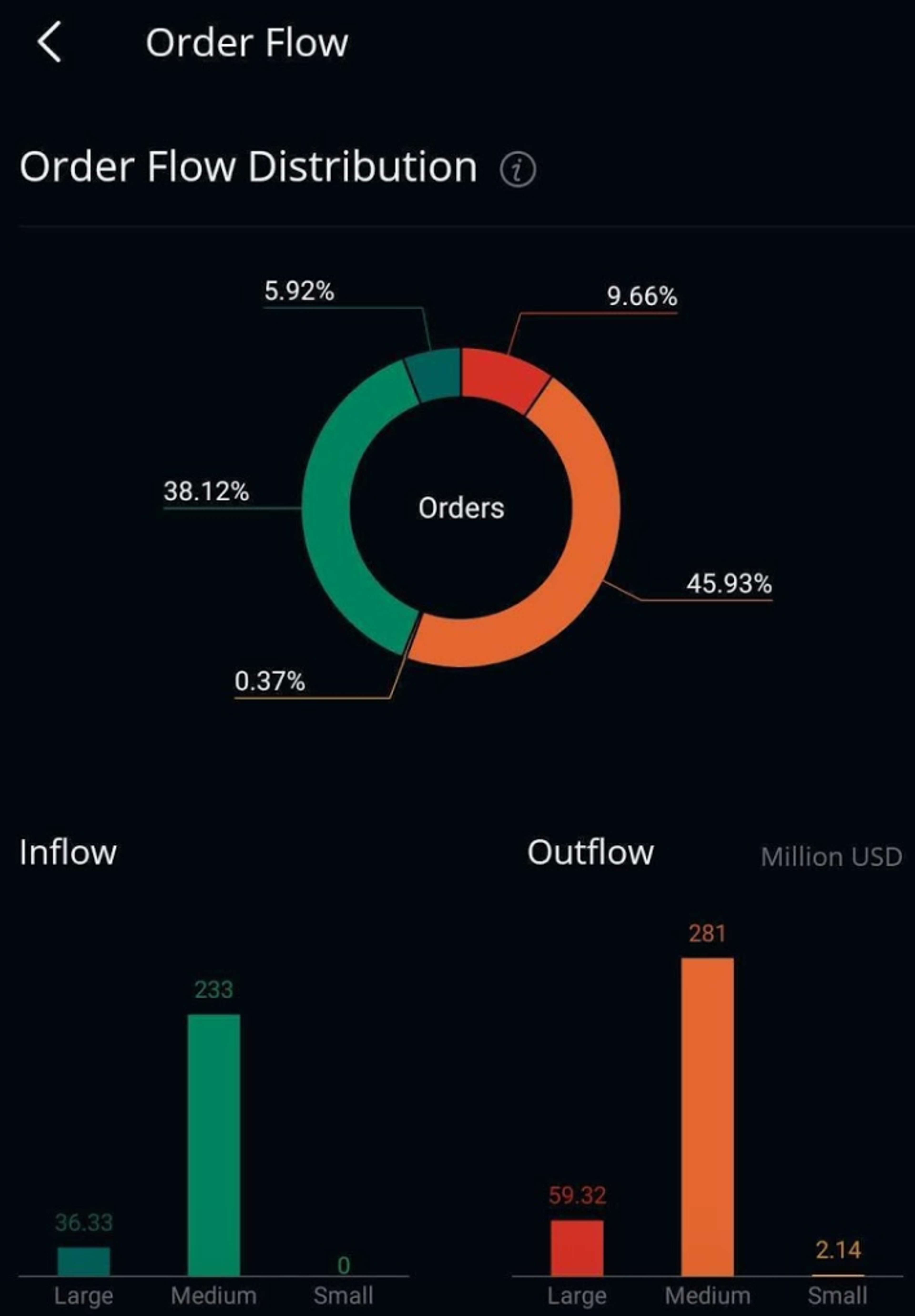
The breakdown of Apple Inc AAPL above shows that 5.92% of the total traded shares, about $36.33 million, were within the top 25% of buy orders, while medium-sized orders made up all but a minuscule amount of the rest of the total shares traded. Of the 25% of small orders, there was less than $1 million worth of shares purchased.
However, if you look at the outflow statistics, it's clear that selling pressure in the stock was stronger across the board. More than 56% of all shares traded so far that day were within sell orders of various sizes. Remember that buyers drive prices higher, and sellers drive it lower.
Used effectively, this information can inform anything from the liquidity of a particular stock to the types of traders buying into or unloading the stock. A higher distribution of large orders might suggest institutional action, while an uptick in the size of smaller orders might suggest a surge in volatility as demand tightens trading.
Webull is a content partner of Benzinga
© 2024 Benzinga.com. Benzinga does not provide investment advice. All rights reserved.
Trade confidently with insights and alerts from analyst ratings, free reports and breaking news that affects the stocks you care about.

