


Loading...
Loading...

The Treasury Department's Dr. Janice "Jan" Eberly put together a deck of slides describing the state of the US economy.
(Link) This is an impressive presentation with charts on many key economic variables. You can't blame the good Doctor for putting a spin on her presentation. After all, this is an election year, so putting lipstick on a pig is to be expected.
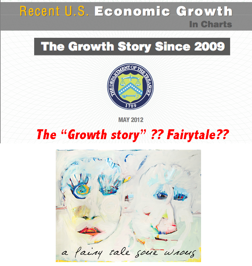
There was one slide that caught my eye. It was in a section labeled:
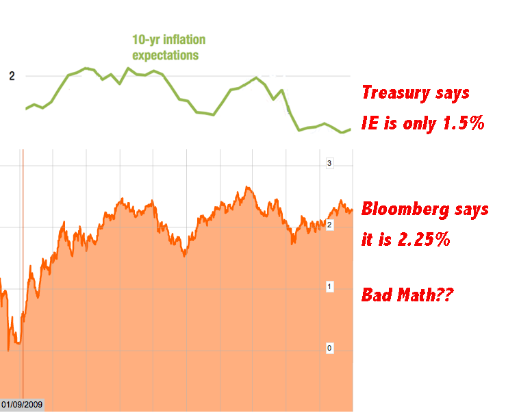
As “evidence” that the US is on the right fiscal footing, the Treasury provided this chart on inflation expectations:
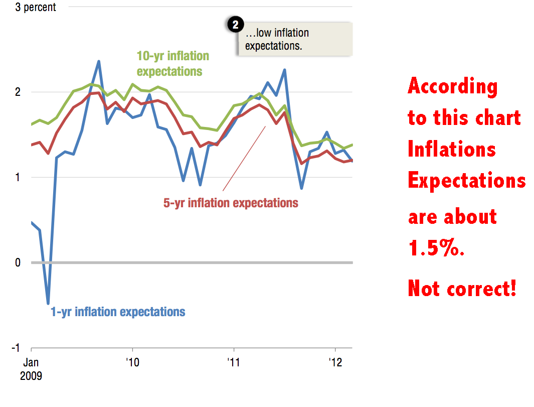
Short and long term inflation expectations are just 1.5% according to this impressive presentation.
I think the chart is wrong.
The Treasury Department does not tell us where it got the information supporting the claim that inflation expectations are so low. The only place I know to look for a market-based forecast on future inflation is the TIPs versus coupon spread. Possibly the Treasury has some other source.
Bloomberg tracks the implied inflation outlook that is derived from market data. This is the Bloomberg methodology:
Loading...
Loading...
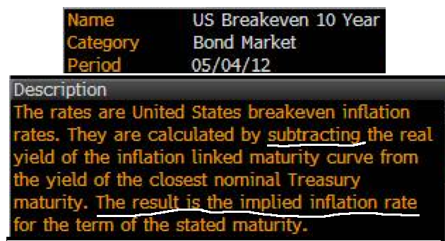
This is pretty simple stuff. Take one number, the prevailing yield on ten-year Treasury bonds, and subtract the yield on the TIPS and presto, we have a future inflation forecast.
10-year minus Tips = Inflation Expectation (IE)
The yields on the respective bonds were as follows as of the close on Friday:
Ten-Year Bond = 1.89%
Ten-Year TIP = -.35%
So the arithmetic is 1.88% minus .34% to produce a forecast of 1.54% for future inflation,
right?WRONG!
The correct calculation is:
1.88 – (-.34) = IE
1.88 + .34 = 2.22%
(Subtracting a negative number is the same adding a positive.)
.
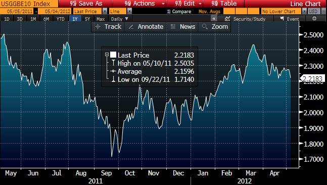
This is the Bloomberg chart for inflation expectations based on the TIPS/Coupon spread. Note that the spread closed at 2.22 of Friday:
The next chart overlays the Treasury IE calculation with that provided by Bloomberg. The Treasury chart consistently understates the actual market results for the entire period.
I contacted the Treasury and asked for a clarification. I think the nice folks at Treasury are pretty busy coming up with happy charts, so they didn't bother to respond to my request.
There are few possible explanations for the discrepancy in the information provided by Dr. Eberly and her crew:
-Treasury has some unknown (and undisclosed) source of information that yields a significantly different view on inflation expectations than the market. (I doubt it).
-Treasury made a mistake in the calculation for Implied Inflation. They did the math wrong. (A distinct possibility.)
-Treasury is making stuff up.
The report by Treasury was widely read. It was favorably referenced in a number of E-Mags. This
article at Business Insider includes the words
“the True State of the Economy” in its title:
.
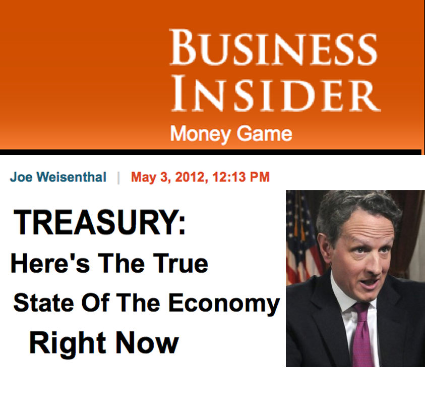
BI reviewed the information from the Treasury and concluded:
"All in all, it's a very useful presentation."
Maybe the folks at BI assumed that the information from the Treasury, had to be right. But it wasn't. My guess is that a few million people looked at the data from Treasury, and a good chunk of them were left with the conclusion,
“Things are getting better, all the signs look good”. That would be the conclusion that the Treasury was trying to elicit.
I'm left wondering. Either Treasury bungled the calculation for Inflation Expectations, or they fudged it. That being the case, what credibility is there for the rest of the information?
.


Loading...
Loading...
© 2024 Benzinga.com. Benzinga does not provide investment advice. All rights reserved.
Posted In: Economics
Benzinga simplifies the market for smarter investing
Trade confidently with insights and alerts from analyst ratings, free reports and breaking news that affects the stocks you care about.
Join Now: Free!
Already a member?Sign in

