


Here are the crucial charts to keep in mind for the first quarter or first half of 2015...they are my base case why we might see much more volatility in the first half and likely a 15 percent - 20 percent correction.
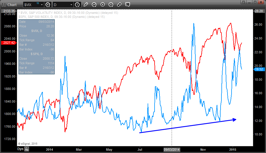
VIX is making higher lows since the summer (blue line), while the S&P 500 is still near its highs.

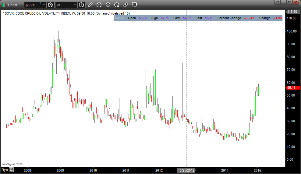
Volatility in commodities, particularly in oil has been on the rise since last summer. Commodity volatility tends to be a precursor to volatility in equities.
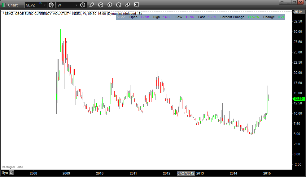
Currencies also have seen more volatility, here is the volatility index of the Euro currency.
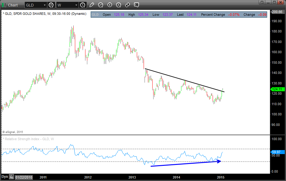
Gold recently broke past a first important resistance line largely due to the deflationary purposes.
The banking index is forming a bearish broadening top formation.
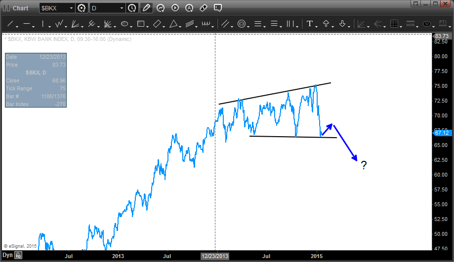
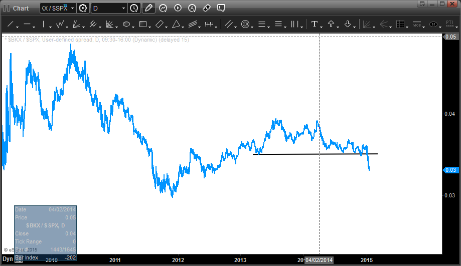
On a ration chart (BKX banking index divided by the S&P 500) we see a major breakdown of the banks.
It's never good to see the banks underperform.
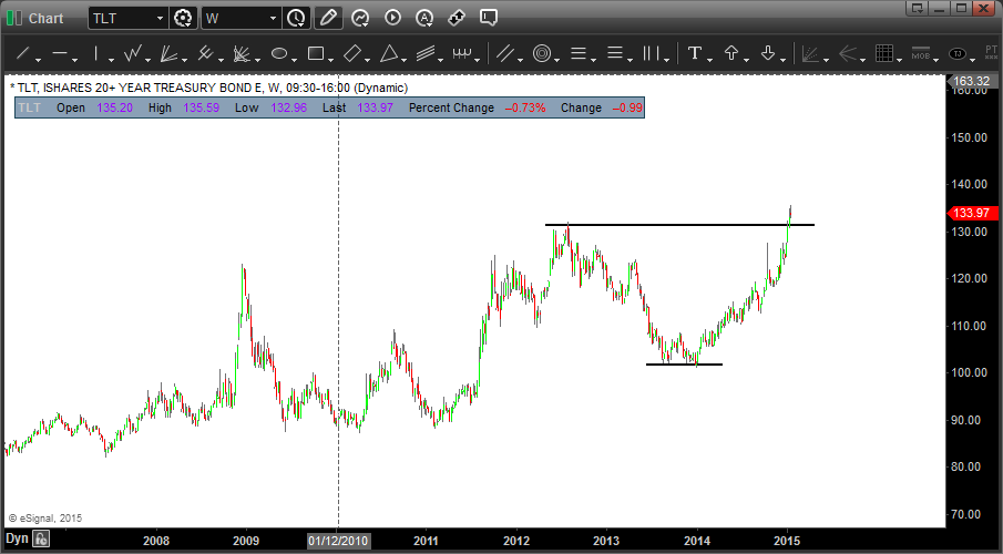
Bonds are breaking higher, i.e. rates going lower.
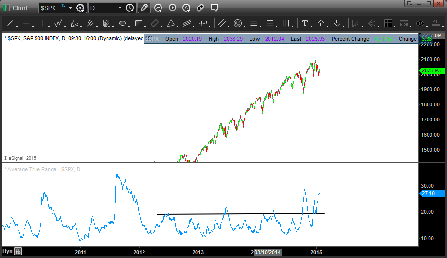
The average true range in the S&P 500, i.e. the average daily swings, recently have risen at least 50 percent above the two year average.
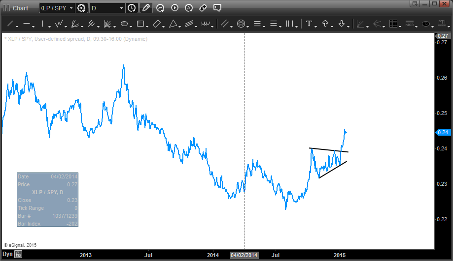
Defensive sectors like the consumer staples are showing relative strength versus the broader market.
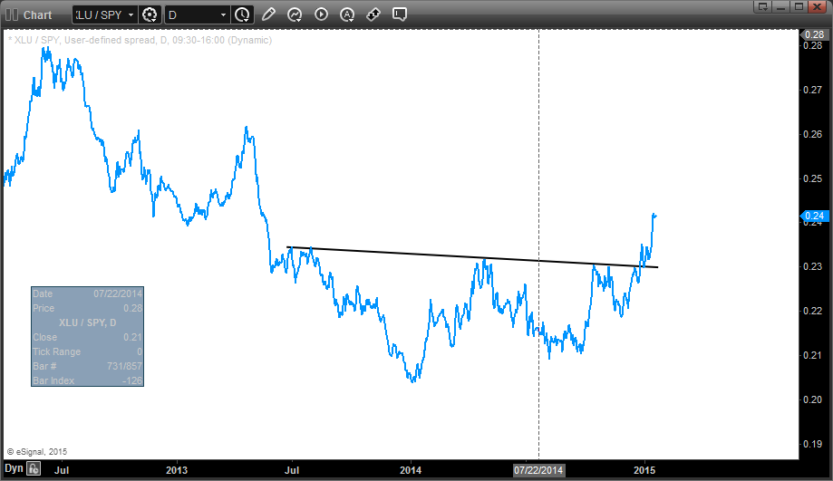
Ditto for utilities.
All of this leads me to believe we shall see much more volatility in the first half of 2015 and possibly a good correction in stocks.
Image credit: Juanjo Willow, Flickr
© 2024 Benzinga.com. Benzinga does not provide investment advice. All rights reserved.
Trade confidently with insights and alerts from analyst ratings, free reports and breaking news that affects the stocks you care about.

