


In our last article we introduced momentum as a strategy. Today we want to talk about momentum and exhaustion regarding the current state and historical S&P 500 levels. ChartLabPro does not use standard indicators as these technical indicators often are full of momentum noise that are not robust and often signal false momentum volatility. This momentum volatility is typical what cause that whip saw reaction with technical analysis.
The graph below is measuring both the trend strength and exhaustion. Remember, the more overbought a market the stronger the trend. Therefore, fully exhausted or overbought markets are often experience shallow mean reversion and historically met with support of dip buyers. As you can reference from the chart an upper level of greater than 90 is considered exhausted while conversely a ready blow -50 is oversold going back to 1993.


-A reading from 87 to equal or greater than 93 resulted in the following since 1997.
-A move from 87 to greater than 93 resulted on average a 4.5% gain in the S&P 500.
-14 times since 1993 the model reached 88.
-8 time or 57% of the time the model reached 93 or greater from an 87 reading.
-Peak to trough Max draw down from greater than 93 resulted on average a 6% max drawdown within 60 days.
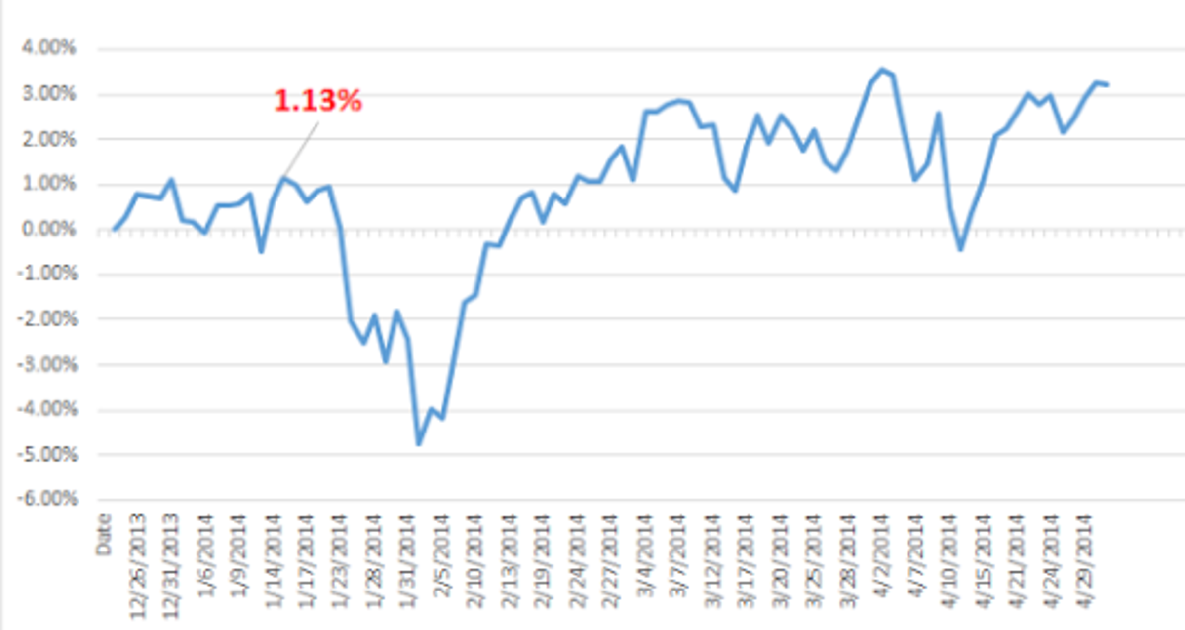
Below are charts of the last 7 times the model went from an 87 to greater than 93. The percentage returns are labeled in the chart from the start of an 87 to peak reading. The following percentage return is showing how the S&P 500 performed over a 60 to 90-day period.


© 2024 Benzinga.com. Benzinga does not provide investment advice. All rights reserved.
Trade confidently with insights and alerts from analyst ratings, free reports and breaking news that affects the stocks you care about.

